
Quick Summary: The best responsive web design companies in 2026 combine technical expertise with creative vision to build websites that adapt seamlessly across all devices. These agencies specialize in mobile-first design, fluid grids, and user-centric experiences that drive conversions. This curated list highlights 15 leading agencies recognized for their responsive design excellence, portfolio quality, and client satisfaction.
Finding the right responsive web design company has become more critical than ever. With mobile traffic dominating the web and screen sizes multiplying, the days of desktop-only websites are long gone.
But here’s the thing—not every agency that claims to build responsive sites actually understands what makes them work. Real responsive design isn’t just about making things smaller. It’s about rethinking layout, navigation, content hierarchy, and interaction patterns for every viewport.
The agencies on this list have proven they can do exactly that. They’ve built websites that look sharp on a 4-inch phone, a tablet in landscape mode, and a 32-inch monitor—all while maintaining performance, accessibility, and brand consistency.
What Makes a Great Responsive Web Design Agency?
Before diving into the agency list, it’s worth understanding what separates exceptional responsive design from the mediocre templated work flooding the market.
Great responsive design starts with mobile-first thinking. Rather than designing for desktop and then cramming everything into smaller screens, top agencies design upward from the smallest viewport. This forces clarity, prioritization, and performance from the start.
Technical execution matters just as much as aesthetics. Fluid grids, flexible images, and CSS media queries form the foundation. But the best agencies go further—implementing responsive typography, touch-friendly interactions, and adaptive loading strategies that serve appropriate assets based on screen size and connection speed.
Testing separates good from great. Top agencies test across real devices—not just browser emulators. They verify touch targets meet minimum size requirements, ensure forms work with mobile keyboards, and validate that content remains readable without zooming.
Mobile-First Methodology
The mobile-first approach has shifted from trend to standard practice. Research from Google shows that 70% of optimization potential lies in creative quality, according to sources discussing creative optimization in marketing, and mobile experiences are now the primary touchpoint for most users.
Agencies embracing this methodology design core functionality and content for small screens first. Then they progressively enhance the experience as screen real estate increases. This ensures the essential user journey works everywhere.
Navigation poses one of the biggest responsive challenges. Top agencies replace sprawling mega-menus with collapsible hamburger menus, priority+ patterns, or tab bars that work naturally with thumb-based navigation.
Performance on All Devices
Responsive design and performance are inseparable. A beautiful layout means nothing if it takes 10 seconds to load on a mobile network.
Leading agencies implement responsive images using srcset and picture elements, serving appropriately sized assets to each device. They lazy-load below-the-fold content, minimize render-blocking resources, and optimize critical rendering paths.
Connection speeds vary wildly across devices and contexts. The best agencies test on throttled 3G connections—not just office WiFi—to ensure experiences remain usable even in suboptimal conditions.
15 Best Responsive Web Design Companies
Now let’s explore the agencies that are setting the standard for responsive design in 2026. Each brings unique strengths, specializations, and approaches to building websites that work everywhere.
1. Gilzor

Gilzor has built a strong reputation for creating custom digital products with responsive web design at their core. They deliver web and mobile applications that adapt seamlessly across all devices while maintaining excellent performance and user experience.
What sets Gilzor apart is their full-cycle approach that combines idea validation, UI/UX design focused on conversion, and technical implementation that ensures every interface feels native on phones, tablets, and desktops. Their responsive websites prioritize both functionality and visual appeal.
The team begins each project with thorough business analysis and user research, then moves through prototyping and iterative design to guarantee the final product works beautifully at every breakpoint. This methodical process helps startups and product companies launch interfaces that scale naturally with growth.
Their portfolio features e-commerce grocery platforms, airline passenger apps, and cognitive training mobile/web solutions — all built with responsive architecture that delivers consistent experiences regardless of screen size. Gilzor excels at turning complex requirements into clean, adaptive digital products.
With expertise in modern web technologies and a user-centric philosophy, Gilzor creates responsive solutions that drive real business outcomes, from early user acquisition to long-term product stability.
Contact Information:
- Website: www.gilzor.com
- Email: [email protected]
- Address: Poland, Warsaw, Office 58, street Adama Mickiewicza 37, 01-625
- LinkedIn: www.linkedin.com/company/gilzor-softwaredevelopment
2. Lengreo

Lengreo has earned recognition as a complete marketing and tech partner that delivers high-converting responsive websites and landing pages. They combine strategic digital marketing with technical development to create experiences that perform across every device.
What distinguishes Lengreo is their results-driven focus on responsive design that directly supports lead generation and conversion goals. Their websites are built to guide users toward key actions whether viewed on mobile or desktop.
The agency follows a structured process of discovery, business analysis, prototyping, and development, ensuring every responsive element is optimized for performance and user behavior. They pay special attention to how layouts, navigation, and calls-to-action adapt intelligently across screen sizes.
Lengreo has helped software development companies, architecture firms, event technology providers, and IT businesses achieve significant growth through responsive websites and optimized digital experiences that turn visitors into qualified opportunities.
Their combination of website development, SEO, and lead-generation tactics creates cohesive responsive platforms that serve as powerful business development tools.
Contact Information:
- Website: Lengreo.com
- Phone: +31 686 147 566
- Email: [email protected]
- Address: Vrijstraat 9 C/D, 5611 AT Eindhoven, Netherlands
- LinkedIn: Lengreo
- Twitter: @Lengreo
- Instagram: @lengreo
3. Mobian Studio

Mobian Studio specializes in building responsive digital products and dedicated engineering teams that ship fast, production-ready solutions for companies that demand flawless experiences across devices.
What makes Mobian noteworthy is their ability to deliver full-stack responsive applications — from mobile-first interfaces to complex web systems — with clean architecture and exceptional attention to cross-device usability.
They work through dedicated teams using end-to-end product development that includes responsive UI/UX, scalable frontends, and backend systems designed to perform consistently on any screen. Their approach ensures smooth interactions whether users are on smartphones, tablets, or large displays.
The studio has delivered responsive solutions for healthcare, fintech, logistics, and IT companies, creating mobile and web applications that maintain high performance and intuitive design across all platforms.
Mobian’s expertise in modern frameworks and adaptive architecture allows them to build responsive products that scale from early validation to high-traffic production environments.
Contact Information:
- Website: mobian.studio
- Phone: [email protected]
- Address: Harju maakond, Tallinn, Kesklinnalinnaosa, Masina tn 22, 10113
- LinkedIn: www.linkedin.com/company/mobian-studio
4. Oski

Oski crafts smart, well-engineered responsive software solutions for tech-forward enterprises and ambitious startups. Their frontend and full-stack development expertise results in interfaces that look and function perfectly on every device.
What sets Oski apart is their AI-accelerated engineering combined with deep focus on responsive design principles. They create flexible, high-performance web solutions that adapt elegantly across breakpoints while preserving speed and visual quality.
The team emphasizes modern frontend technologies and thoughtful UI/UX design to build responsive experiences that feel native to each platform. Every project receives careful attention to layout flexibility, touch interactions, and performance optimization.
Oski serves industries including e-commerce, travel, logistics, fintech, education, and insurance, delivering responsive web applications, portals, and digital platforms that enhance user engagement across all screen sizes.
Their cloud-first and frontend solutions ensure responsive websites and applications remain fast, secure, and visually compelling regardless of how users access them.
Contact Information:
- Website: oski.site
- Phone: +48571282759
- Email: [email protected]
- Address: Kaupmehe tn 7, 10114 Tallinn, Estonia
- LinkedIn: www.linkedin.com/company/oski-solutions
5. A-listware

A-listware delivers responsive digital solutions through expert software development and dedicated teams that prioritize seamless experiences across all devices. They help businesses build high-quality, adaptive web applications that perform reliably everywhere.
What distinguishes A-listware is their ability to provide end-to-end responsive development — from UX/UI design to full implementation — with strong emphasis on clean, maintainable code and cross-device consistency.
Their process includes software consulting, custom development, team augmentation, and modernization of legacy systems into modern responsive architectures. Every solution is designed with mobile-first thinking and thorough testing across platforms.
The company works with enterprises, small and medium businesses, and startups across various sectors, creating responsive enterprise applications, customer portals, and digital tools that maintain excellent usability on any screen.
With broad technical expertise in cloud solutions, UI/UX, and full software engineering services, A-listware builds responsive digital experiences that scale effectively and integrate smoothly with existing business systems.
Contact Information:
- Website: a-listware.com
- Phone: +1 (888) 337 93 73
- Email: [email protected]
- Address: North Bergen, NJ 07047, USA
- LinkedIn: www.linkedin.com/company/a-listware
- Facebook: www.facebook.com/alistware
6. Ueno
Ueno takes a product design approach to responsive web design, treating websites as digital products requiring the same rigor as native applications. Now part of the Fjord network, they maintain their distinctive design-driven culture.
The agency’s responsive designs prioritize usability and clarity. They conduct extensive user testing across devices, iterating based on real behavior rather than assumptions. This results in responsive interfaces that feel intuitive regardless of how users access them.
Ueno’s process includes creating responsive prototypes early in the design phase. Rather than static mockups, they build functioning prototypes that clients and users can test on actual devices, revealing responsive design issues before development begins.
Their client work spans fintech, healthcare, e-commerce, and media. They’re particularly strong at responsive dashboard design and web applications requiring complex information architecture across screen sizes.
The agency’s visual design balances personality with function. Their responsive sites use bold color, distinctive typography, and unexpected layouts while maintaining usability and accessibility standards.
7. Build in Amsterdam

Build in Amsterdam brings Dutch design principles—clarity, functionality, typography-driven layouts—to responsive web design. Their work demonstrates that responsive doesn’t mean boring.
The agency creates structured, grid-based responsive designs that adapt through intelligent breakpoint strategies. Rather than simply stacking elements vertically on mobile, they rethink layouts to maintain visual interest and hierarchy at every size.
Build in Amsterdam’s responsive designs often feature striking typography that scales beautifully, maintaining impact from small screens to large displays. They understand that type isn’t just text—it’s a primary design element that must work responsively.
Their development team implements responsive designs with clean, maintainable code. They favor modern CSS features like Grid and Flexbox, creating layouts that adapt fluidly without JavaScript dependencies or complex calculations.
The agency works with clients across Europe and North America, including cultural institutions, tech companies, and professional service firms. Their responsive websites balance European design sophistication with pragmatic functionality.
8. Area 17

Area 17 specializes in responsive design for arts and culture organizations, though their expertise extends to education, media, and nonprofit sectors. They understand the unique challenges of presenting rich content across devices.
The New York and Paris-based agency excels at responsive content-heavy websites—digital archives, editorial platforms, and institutional sites with complex information architectures. Their designs make dense content accessible and navigable on any screen.
Area 17 developed Twill, an open-source CMS framework optimized for responsive content management. This tool reflects their understanding that great responsive design requires equally flexible content administration tools.
Their responsive designs often incorporate sophisticated filtering, search, and browsing interfaces that adapt to different interaction paradigms. Desktop users get information-dense layouts; mobile users get streamlined, gesture-based navigation.
The agency’s portfolio includes websites for major museums, foundations, and cultural institutions. Their responsive designs respect content and user needs equally, never sacrificing one for the other.
9. Instrument

Instrument brings strategic thinking and brand expertise to responsive web design. Based in Portland, they create websites that function as complete brand experiences across every touchpoint.
The agency’s responsive designs emerge from brand strategy, ensuring visual identity, messaging, and user experience remain consistent across devices. They understand that many users interact with brands across multiple screens throughout their journey.
Instrument’s technical implementations handle complex requirements including e-commerce, customer portals, and marketing automation integrations. Their responsive sites maintain functionality and brand consistency whether accessed from phone, tablet, or desktop.
Their client roster includes major consumer brands, tech companies, and startups. They’re particularly adept at responsive e-commerce design, creating shopping experiences that convert across devices without feeling generic.
The agency employs a collaborative process, working closely with client teams throughout design and development. This partnership approach ensures responsive designs align with business goals, technical constraints, and user needs.
10. Huge

Huge operates at enterprise scale, designing responsive digital experiences for global brands with complex requirements. Their work spans web design, mobile apps, and digital platforms requiring consistency across every touchpoint.
The agency’s responsive design practice emphasizes design systems and component libraries. They create comprehensive responsive frameworks that maintain consistency across hundreds of pages, multiple markets, and various device types.
Huge’s technical capabilities include extensive device testing, performance optimization, and accessibility compliance. Their responsive implementations meet enterprise requirements for security, scalability, and maintainability.
They work with Fortune 500 companies, major retailers, and global brands requiring responsive designs that work in dozens of countries, languages, and markets. Their solutions handle localization, internationalization, and regional variations while maintaining responsive design integrity.
The agency’s process includes quantitative testing and analytics, measuring how responsive designs perform in the real world. They iterate based on actual device usage patterns, connection speeds, and user behavior across different contexts.
11. Excited Agency

Excited Agency has built a reputation for product-first web design that scales beautifully across devices. Based in the United States, they combine UX research, visual design, and technical implementation into cohesive responsive experiences.
What sets Excited apart is their focus on conversion-driven design rather than surface-level aesthetics. Their responsive websites prioritize clarity and structure, ensuring key actions remain obvious and accessible regardless of screen size.
The agency approaches each project through extensive user research, identifying how different audiences interact with websites across devices. This research informs mobile and desktop experiences that feel tailored rather than compromised.
Their portfolio includes work for SaaS companies, tech startups, and digital products requiring complex responsive interfaces. They’re particularly strong at building dashboards and web applications that remain functional on tablets and mobile devices.
With a team of 30-50 employees, Excited maintains the agility of a boutique agency while having the resources to handle substantial projects. The agency has received strong Clutch ratings for their responsive design expertise and collaborative process.
12. Clay

Clay has become synonymous with high-end responsive web design for ambitious brands. Their work features bold typography, sophisticated animations, and layouts that adapt elegantly across the entire device spectrum.
The San Francisco-based agency attracts clients seeking to make a statement online. Their responsive designs balance artistic ambition with technical precision, creating experiences that feel custom-crafted for each screen size.
Clay’s process emphasizes design exploration and iteration. They develop multiple responsive concepts, testing how different approaches work at various breakpoints before committing to a direction. This ensures the chosen design truly works everywhere, not just in desktop mockups.
Their technical team implements responsive designs using modern frameworks and progressive enhancement techniques. Interactions feel native to each platform—touch gestures on mobile, hover states on desktop, keyboard navigation for accessibility.
The agency works with venture-backed startups, established tech companies, and consumer brands. Their responsive designs often become marketing assets themselves, winning awards and generating buzz that extends far beyond the website’s functional purpose.
13. Basic Agency (DEPT)

Basic Agency, now part of the DEPT network, brings enterprise-scale resources to responsive web design challenges. They’ve built responsive sites for major brands requiring robust content management, localization, and performance at scale.
The agency excels at responsive design systems—creating component libraries and guidelines that ensure consistency across hundreds of pages and multiple device types. This systematic approach makes ongoing maintenance and content updates feasible for large organizations.
Their responsive implementations handle complex requirements like e-commerce catalogs, video backgrounds, and interactive data visualizations. These elements adapt intelligently, delivering full experiences on capable devices while gracefully degrading on limited hardware.
Basic Agency’s technical infrastructure includes rigorous device testing, performance monitoring, and accessibility validation. They ensure responsive sites meet WCAG standards and work with assistive technologies across platforms.
The agency serves clients across industries including retail, finance, entertainment, and technology. Their responsive designs balance brand expression with the practical demands of enterprise websites serving diverse audiences across countless device configurations.
14. Fantasy

Fantasy specializes in interactive experiences that push the boundaries of what’s possible in responsive web design. Based in New York, they create websites with sophisticated animations, scroll-triggered effects, and immersive storytelling that adapts to every screen.
What makes Fantasy noteworthy is their ability to deliver ambitious interactive concepts without sacrificing mobile performance. Their responsive designs use conditional loading, optimized assets, and careful performance budgets to ensure fluid experiences everywhere.
The agency’s work often features parallax scrolling, video integration, and custom illustrations that respond to user interaction. These elements scale intelligently—delivering full experiences on desktop while adapting to simpler, touch-friendly versions on mobile.
Fantasy’s client roster includes fashion brands, cultural institutions, and entertainment companies seeking to create memorable digital experiences. Their responsive designs often blur the line between website and art installation.
Their development team employs cutting-edge web technologies including WebGL, GSAP animation libraries, and custom JavaScript frameworks. Despite the technical complexity, their sites maintain excellent performance scores and work reliably across browsers and devices.
15. Locomotive

Locomotive brings a refined, European design sensibility to responsive web development. The Montreal-based agency creates elegant, minimalist websites with meticulous attention to typography, whitespace, and motion design.
Their responsive approach emphasizes content over decoration. Layouts breathe, giving text and images room to shine at every screen size. Navigation remains unobtrusive, and interactions feel purposeful rather than gratuitous.
Locomotive developed their own smooth scroll library and locomotive-scroll framework, tools used by designers worldwide to create fluid scrolling experiences that work across devices. This technical contribution demonstrates their deep understanding of responsive interaction design.
The agency works with cultural organizations, architecture firms, and lifestyle brands valuing sophisticated design. Their responsive websites often win awards from Awwwards, CSS Design Awards, and other design competition platforms.
Their portfolio showcases exceptional responsive typography—type scales that adjust proportionally, line lengths that remain readable, and hierarchies that adapt to maintain visual clarity from phone to desktop.
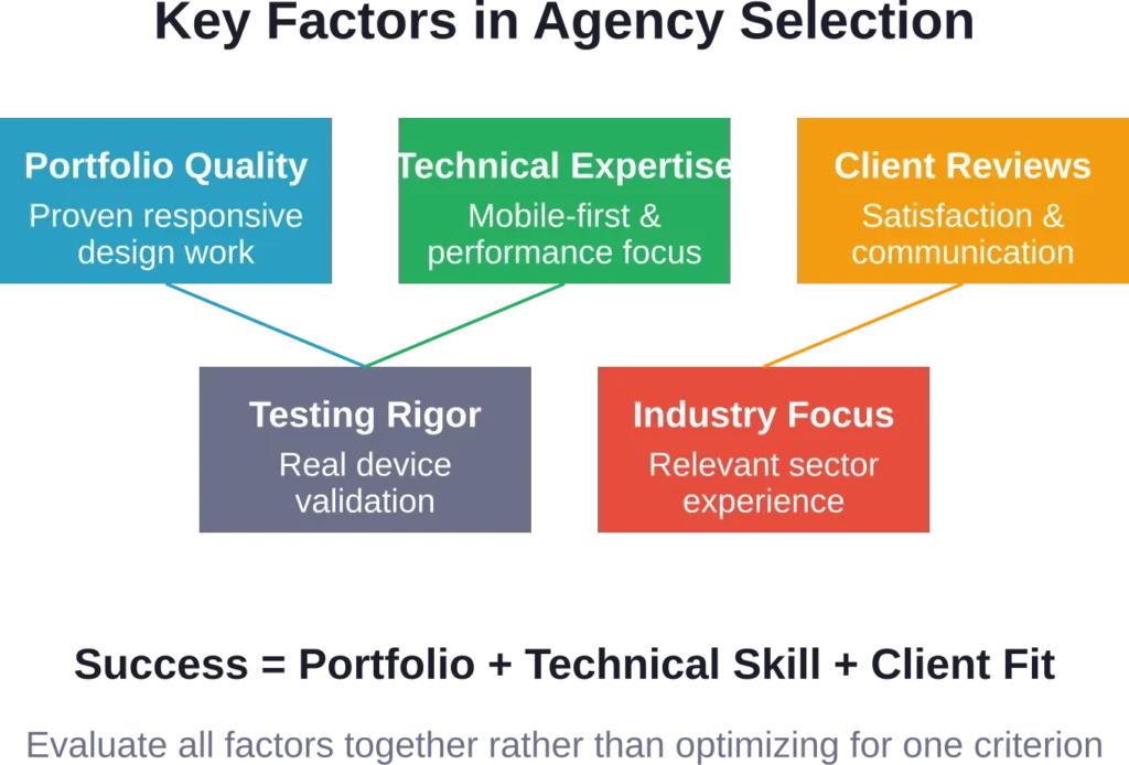
How to Choose the Right Responsive Design Agency
Selecting from this list—or any list—requires evaluating your specific needs against each agency’s strengths. The right partner for a venture-backed SaaS company differs dramatically from the ideal choice for a nonprofit or e-commerce brand.
Start by examining portfolios on actual devices. Don’t just view case studies on your desktop—pull out your phone and tablet. Navigate their responsive designs, test interactions, check load times, and evaluate how well layouts adapt.
Review Responsive-Specific Work
Not all portfolio work receives equal responsive treatment. Some agencies excel at desktop design but deliver mediocre mobile experiences. Others create stunning mobile sites but struggle with tablet and desktop layouts.
Look for case studies that specifically discuss responsive design challenges and solutions. The best agencies explain their breakpoint strategy, discuss mobile-specific interaction patterns, and show how they optimized performance across devices.
Client testimonials should mention cross-device experience. If reviews only praise visual design without mentioning mobile usability or responsive functionality, that’s a red flag.
Evaluate Technical Capabilities
Beautiful mockups mean nothing if the agency can’t implement them properly. Responsive design requires solid front-end development skills, performance optimization knowledge, and experience with modern CSS and JavaScript.
Ask agencies about their responsive implementation process. Do they use CSS frameworks or custom code? How do they handle responsive images? What’s their testing process across devices and browsers?
Check if their portfolio sites themselves are well-built. View source, run Lighthouse audits, test on various devices. An agency with a poorly implemented portfolio site probably won’t deliver better work for clients.
Consider Industry Experience
While great design principles apply universally, industry-specific experience matters. E-commerce sites have different responsive requirements than editorial platforms or SaaS dashboards.
Agencies with relevant industry experience understand common patterns, user expectations, and technical constraints in your space. They’ve solved similar responsive challenges before and can apply that knowledge to your project.
That said, don’t over-weight industry experience. A talented agency without direct experience in your sector but with strong responsive expertise often outperforms a mediocre agency that happens to have built sites in your industry.
Assess Communication and Process
Responsive design projects require close collaboration. You’ll make countless decisions about how content, layout, and functionality adapt across breakpoints. Clear communication and an inclusive process matter enormously.
During initial conversations, notice how agencies explain their responsive design approach. Do they ask good questions about your users, their devices, and usage contexts? Or do they immediately pitch a predetermined solution?
Request to speak with past clients about the working relationship. Were responsive design decisions collaborative? Did the agency proactively identify and solve cross-device issues? Were timelines and budgets respected?
Common Responsive Design Challenges
Even the best agencies face recurring challenges when building responsive websites. Understanding these issues helps set realistic expectations and evaluate how well agencies address them.
Navigation Complexity
Complex navigation structures pose the biggest responsive design challenge. Desktop sites often feature mega-menus with dozens of links, organized into multiple columns with supporting imagery.
That navigation paradigm breaks completely on mobile. There’s no room for multi-column layouts, hover interactions don’t exist on touch devices, and screen real estate is too precious to dedicate entirely to navigation.
Top agencies solve this through progressive disclosure—hiding navigation initially, revealing it through a menu button, and organizing links into collapsible categories. The best implementations feel natural on mobile while maintaining the full navigation structure.
Data Tables and Complex Content
Tables, charts, and data-heavy content resist responsive design. A ten-column table that works fine on desktop becomes unreadable when squeezed onto a phone screen.
Agencies handle this through various strategies. Some tables reflow into card-based layouts on mobile. Others implement horizontal scrolling for specific content blocks while keeping the overall page responsive. Some prioritize key columns and hide secondary data behind progressive disclosure.
There’s no universal solution. The right approach depends on content structure, user needs, and usage context. Strong agencies evaluate each situation individually rather than applying template solutions.
Forms and Input Fields
Forms require special attention in responsive design. Desktop forms often use multi-column layouts, placing related fields side-by-side to reduce perceived length.
Mobile forms work differently. Single-column layouts work best, ensuring fields remain large enough for accurate touch input and mobile keyboards don’t obscure content. Field validation and error messages need clear mobile-optimized designs.
Progressive web applications and complex web tools present even greater challenges. Dashboards, configuration interfaces, and data entry forms require thoughtful responsive strategies that maintain functionality while adapting to different input methods and screen sizes.
Performance Across Networks
Responsive design solves layout problems, but performance requires separate attention. A responsive site with massive images and unnecessary JavaScript still delivers poor mobile experiences.
Leading agencies implement performance budgets, limiting total page weight and load times. They use responsive images serving appropriately sized assets to each device. They minimize and defer non-critical JavaScript and CSS.
Connection speed varies dramatically across contexts. Users on unlimited data plans and WiFi have different experiences than those on metered mobile data or slow connections. The best responsive designs remain usable across this entire spectrum.
Testing Responsive Designs
Building responsive websites is only half the challenge. Testing them thoroughly across devices, browsers, and contexts ensures they actually work as intended.
Top agencies maintain device labs with real hardware—various iPhone and Android phones, tablets, and other devices. While browser developer tools help during development, nothing replaces testing on actual hardware.
Real Device Testing
Emulators and responsive design modes in browser developer tools provide quick feedback during development. But they don’t replicate real device behavior, touch interactions, or performance characteristics.
Professional agencies test on actual devices representing their target audience. That includes current flagship phones, mid-range devices, older hardware still in widespread use, and tablets of various sizes.
Touch interactions require particular attention. Tap targets need adequate size and spacing. Gestures like swipe and pinch-to-zoom should work intuitively. Text remains readable without zooming. These factors only reveal themselves through real device testing.
Browser and OS Coverage
Responsive sites must work across browsers and operating systems. Safari on iOS, Chrome on Android, Samsung Internet, and various desktop browsers all render web content slightly differently.
Agencies should test across this browser matrix, not just Chrome. CSS features have varying support levels. JavaScript APIs behave differently. Even fundamental layout mechanisms like Flexbox and Grid have browser-specific quirks.
Older devices and browsers present additional challenges. While most agencies no longer support Internet Explorer, they must decide how far back their browser support extends and how gracefully sites degrade on unsupported platforms.
Accessibility Testing
Responsive design and accessibility intersect significantly. Mobile users with disabilities face additional challenges—smaller screens complicate screen reader navigation, touch targets must accommodate motor impairments, and color contrast matters even more on bright outdoor screens.
Strong agencies test with screen readers, keyboard navigation, and voice control. They ensure responsive breakpoints don’t break accessibility, forms remain properly labeled across devices, and content order makes sense when linearized.
Automated accessibility testing catches many issues, but manual testing with real assistive technologies reveals problems that automated tools miss. The best agencies combine both approaches.
| Testing Type | What It Validates | Tools & Methods | Priority Level |
|---|---|---|---|
| Real Device Testing | Touch interactions, performance, actual rendering | Physical device lab, cloud testing services | Critical |
| Browser Compatibility | Cross-browser rendering, feature support | BrowserStack, manual testing, feature detection | Critical |
| Performance Testing | Load times, asset sizes, network performance | Lighthouse, WebPageTest, throttled connections | Critical |
| Accessibility Testing | Screen reader compatibility, keyboard nav, WCAG compliance | Screen readers, axe DevTools, manual testing | High |
| Responsive Breakpoints | Layout at various viewport sizes | Browser DevTools, responsive checker tools | High |
| Content Testing | Real content behavior, edge cases, long text | Production-like content, stress testing | Medium |
Responsive Design Trends in 2026
Responsive web design continues evolving. The agencies on this list stay current with emerging techniques, technologies, and user expectations shaping the field.
Container Queries
CSS container queries have transformed responsive design since gaining widespread browser support. Unlike media queries that respond to viewport size, container queries let components respond to their container’s size.
This enables truly modular responsive components that adapt to their context regardless of screen size. A card component can use different layouts depending on whether it’s in a sidebar or main content area, without knowing anything about the overall viewport.
Leading agencies now build component libraries using container queries, creating more flexible design systems that work in varied contexts. This approach reduces CSS complexity and makes responsive designs more maintainable.
Variable Fonts
Variable fonts allow single font files to contain multiple styles and weights, with smooth interpolation between them. This technology dramatically improves responsive typography while reducing page weight.
Responsive sites can adjust font weight, width, and other parameters fluidly across breakpoints. Typography can adapt precisely to available space rather than jumping between discrete font files.
The best agencies now implement variable fonts strategically, creating responsive type systems that maintain readability and visual hierarchy across the full device spectrum while loading faster than traditional multi-file font implementations.
Scroll-Linked Animations
Scroll-triggered animations have become more sophisticated and performant. New CSS capabilities and JavaScript libraries enable smooth, performant animations tied to scroll position.
These animations adapt responsively, adjusting their parameters based on screen size and interaction method. Desktop users might see elaborate parallax effects while mobile users get simpler, more performant animations that conserve battery and processing power.
Top agencies implement scroll animations judiciously, ensuring they enhance rather than hinder responsive experiences. Animation becomes progressive enhancement—adding delight on capable devices without breaking functionality on limited hardware.
Dark Mode and Color Schemes
Responsive design now extends beyond layout to encompass responsive color schemes. Users increasingly expect websites to respect their system-level dark mode preferences.
Modern responsive sites detect color scheme preferences and adapt their palettes accordingly. This requires rethinking color systems, ensuring sufficient contrast in both light and dark modes, and testing visual hierarchy across themes.
The best implementations go beyond simple dark mode toggles, using CSS custom properties and prefers-color-scheme media queries to create sophisticated responsive color systems that work across devices and user preferences.
Budget and Timeline Considerations
Responsive web design projects vary dramatically in scope, complexity, and cost. Understanding typical ranges helps set realistic expectations, though specific projects require custom quotes.
Simple responsive websites—marketing sites with a handful of pages, straightforward content, and template-based designs—represent the low end of the spectrum. These projects typically take several weeks and serve small businesses or simple use cases.
Mid-range responsive projects include custom designs, more complex functionality, content management systems, and multiple user types. These sites require several months and involve significant design and development effort.
Enterprise responsive projects—extensive sites with complex requirements, integrations, design systems, and ongoing support—represent major investments. These projects span many months, involve large teams, and require substantial budgets.
Timeline Factors
Responsive web design timelines depend on multiple factors beyond simple page count. Content strategy and creation often consume more time than design and development.
The number of unique responsive breakpoints and layout variations affects timeline significantly. A site with carefully crafted layouts for phone, tablet portrait, tablet landscape, desktop, and wide desktop takes longer than one with simpler adaptive strategies.
Testing and iteration add time but improve quality dramatically. Agencies that rush through device testing and user validation deliver technically functional but suboptimal responsive experiences. The best agencies build adequate testing and refinement time into their schedules.
Client collaboration affects timelines substantially. Projects with clear decision-makers, organized feedback, and timely content delivery progress smoothly. Those with multiple stakeholders, slow approval processes, or content delays extend significantly.
Frequently Asked Questions
Responsive web design is an approach to building websites that adapt fluidly to different screen sizes and devices. Rather than creating separate mobile and desktop versions, responsive sites use flexible grids, fluid images, and CSS media queries to automatically adjust layout, content, and functionality based on viewport size. This ensures optimal viewing and interaction experiences across phones, tablets, laptops, and desktop monitors.
Responsive web design costs vary enormously based on complexity, scope, and agency expertise. Simple template-based responsive sites might start around a few thousand dollars. Custom responsive designs for small to medium businesses typically range from several thousand to tens of thousands. Complex responsive projects for larger organizations with extensive requirements often reach six figures. Rather than focusing on generic ranges, define your specific needs and request quotes from agencies matching your requirements.
Timeline depends on project complexity and scope. A simple responsive site using templates or existing themes might launch within weeks. Custom responsive designs typically require two to four months for design, development, content integration, and testing. Large-scale responsive projects with complex functionality, extensive content, and multiple stakeholder reviews often span four to six months or longer. Realistic timelines account for design iteration, content creation, thorough device testing, and revision cycles.
Well-built responsive websites work across the vast majority of modern devices and browsers. Professional agencies test on various phones, tablets, and desktop browsers to ensure broad compatibility. However, very old browsers or devices may have limited support. Agencies define a browser support matrix early in projects, specifying which platforms receive full support, which get basic functionality, and which aren’t supported. Modern responsive sites typically support all current browsers and devices from the past several years.
Responsive design uses fluid grids and flexible layouts that adjust continuously as viewport size changes. Adaptive design uses fixed layouts at specific breakpoints, serving different static layouts based on detected device characteristics. Responsive is more flexible and requires less maintenance since layouts adapt automatically. Adaptive allows more control over specific device experiences but requires maintaining multiple separate layouts. Most modern projects use responsive approaches, sometimes incorporating adaptive techniques for specific components requiring precise control.
Existing sites can be retrofitted with responsive design, though the effort required varies. Sites with clean, semantic HTML and separated CSS can often be made responsive through CSS updates and relatively modest restructuring. Sites with table-based layouts, inline styles, and tightly coupled markup require more extensive work. In many cases, building a new responsive site proves more efficient than retrofitting an old non-responsive one. Agencies can audit existing sites and recommend whether retrofitting or rebuilding makes more sense.
Test responsive websites by viewing them on actual devices—phones, tablets, and desktops of various sizes. Resize browser windows to check how layouts adapt. Use browser developer tools’ responsive design modes to preview various viewport sizes. Check that text remains readable without zooming, navigation works on touch devices, images scale appropriately, and interactive elements have adequate touch targets. Professional testing includes real device labs, various browsers and operating systems, different network speeds, and accessibility validation with screen readers and keyboard navigation.
Making Your Decision
The agencies on this list represent diverse approaches to responsive web design. Some excel at bold, interaction-rich experiences. Others focus on clean, content-first designs. Some serve enterprise clients while others work with startups and mid-market companies.
Your ideal partner depends on your specific context—your industry, audience, technical requirements, timeline, and budget. The “best” agency is the one whose strengths align with your needs, whose process fits your organization, and whose work resonates with your vision.
Start by deeply understanding your own requirements. Who are your users? What devices do they use? What are their primary tasks and goals? What technical constraints or integrations matter? What’s your timeline and budget reality?
Then evaluate agencies against those specific criteria rather than generic “best of” rankings. Review their responsive work on real devices. Talk to their past clients. Understand their process and technical approach. The right fit becomes obvious when you’ve done this homework.
Conclusion
Responsive web design has evolved from experimental technique to fundamental requirement. Users expect websites to work flawlessly regardless of how they access them. The agencies on this list have proven their ability to deliver on that expectation.
Each agency brings unique strengths—technical expertise, creative vision, industry specialization, or process excellence. Some push the boundaries of what’s possible in responsive design. Others deliver reliable, proven solutions to common challenges.
The responsive design landscape continues evolving. New CSS features, changing device patterns, and shifting user expectations demand agencies stay current. The best partners combine deep expertise with intellectual curiosity, applying both established best practices and emerging techniques appropriately.
Building a responsive website is a significant investment. Choose your agency partner carefully, focusing on proven responsive expertise, relevant experience, and strong collaborative processes. The right agency doesn’t just deliver a responsive website—they create a digital foundation that serves your users and supports your business goals across every device.
Ready to start your responsive web design project? Review the agencies on this list, explore their portfolios on multiple devices, and reach out to those whose work and approach align with your needs. The perfect responsive website is waiting to be built.