

Quick Summary: The best responsive web design companies in 2026 combine user experience expertise, technical excellence, and strategic thinking to create websites that perform across all devices. This guide profiles 15 leading agencies—from product-focused studios like Excited to design powerhouses like Clay and Code and Theory—each bringing unique strengths to responsive design, whether that’s SaaS interfaces, e-commerce platforms, or brand-driven experiences.
Responsive web design isn’t optional anymore. With users switching between phones, tablets, and desktops constantly, a website that breaks on mobile is a website that breaks your business.
But finding a web design agency that truly understands responsive design—not just fluid grids, but the entire ecosystem of performance, accessibility, and user intent across devices—is harder than it should be.
Some agencies talk a good game about mobile-first. Others slap a template on your content and call it responsive. The best ones? They treat responsive design as a strategic discipline, where every breakpoint decision impacts conversion rates and every interaction pattern considers thumb reach and cognitive load.
This list cuts through the noise. These 15 responsive web design companies have proven track records building sites that work beautifully everywhere, backed by real client results and recognition from design communities like Awwwards and platforms like Clutch.
What Makes a Great Responsive Web Design Company?
Before diving into specific agencies, let’s establish what separates exceptional responsive design firms from the rest.
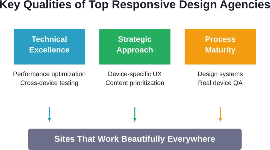
First, technical expertise. Modern responsive design goes beyond CSS media queries. It involves performance optimization for mobile networks, progressive enhancement strategies, and increasingly, considerations around AI-driven caching techniques that can boost performance metrics significantly.
According to technical analyses, AI-driven caching can increase cache hit rates by 15%, reducing latency and improving mobile user experience—a critical factor when mobile users won’t wait more than a few seconds for pages to load.
Second, strategic thinking. The best agencies don’t just adapt desktop designs for smaller screens. They rethink information architecture, prioritize content differently across devices, and design interaction patterns that work for touch, mouse, and keyboard.
Third, process maturity. Top firms conduct device-specific user research, test across real devices (not just emulators), and maintain design systems that scale across breakpoints without creating maintenance nightmares.
Top 15 Responsive Web Design Companies for 2026
1. Oski

Oski delivers smart, well-engineered responsive web solutions for tech-forward enterprises and ambitious startups that demand both performance and exceptional user experiences.
With deep expertise in frontend technologies, Oski creates adaptable interfaces that scale seamlessly across devices. Their work focuses on innovative design, intuitive navigation, and robust performance — whether for complex web applications, e-commerce platforms, or content-heavy sites.
Oski stands out through their commitment to flexible, future-proof responsive architectures. They combine modern frameworks with thoughtful UI/UX practices to ensure sites remain fast, accessible, and visually compelling on everything from smartphones to desktop displays.
Contact Information:
- Website: oski.site
- Phone: +48571282759
- Email: [email protected]
- Address: Kaupmehe tn 7, 10114 Tallinn, Estonia
- LinkedIn: www.linkedin.com/company/oski-solutions
2. A-listware

A-listware operates at the forefront of software development and design, offering responsive web solutions that prioritize quality, security, and user engagement for enterprises, SMBs, and startups.
This team brings extensive experience in UX/UI and frontend development to craft responsive experiences that maintain consistency and brand excellence across all breakpoints. Their services include responsive web design as part of creating vibrant, goal-oriented digital interfaces.
What distinguishes A-listware is their full-spectrum approach — combining custom development, UX/UI expertise, and technical implementation to deliver websites and applications that perform reliably on any device while meeting enterprise standards for scalability and accessibility.
Contact Information:
- Website: a-listware.com
- Phone: +1 (888) 337 93 73
- Email: info@a-listware.com
- Address: North Bergen, NJ 07047, USA
- LinkedIn: www.linkedin.com/company/a-listware
- Facebook: www.facebook.com/alistware
3. Mobian

Mobian delivers high-performance responsive web experiences as part of their full-stack digital product development, helping companies ship polished, scalable solutions across devices.
This European studio builds dedicated engineering teams that create responsive web interfaces integrated with mobile and backend systems. They focus on clean architecture, intuitive user experiences, and production-ready code that performs consistently from smartphones to large desktop screens. Their approach ensures seamless adaptation across breakpoints while maintaining speed and usability.
What sets Mobian apart in responsive design is their emphasis on real-world performance and future-proof architecture. They deliver web solutions that scale effortlessly, integrate with complex systems, and provide excellent user experiences whether accessed on mobile, tablet, or desktop — all backed by rigorous QA and post-launch support.
Mobian particularly excels with companies in IT, Healthcare, Fintech, and Logistics that need responsive web platforms to support business-critical operations, user engagement, and growth across all devices.
Contact Information:
- Website: mobian.studio
- Phone: [email protected]
- Address: Harju maakond, Tallinn, Kesklinnalinnaosa, Masina tn 22, 10113
- LinkedIn: www.linkedin.com/company/mobian-studio
4. Lengreo

Lengreo approaches responsive web design as a core part of their integrated marketing and tech solutions, building websites that drive measurable business growth.
What sets Lengreo apart is their conversion-focused approach to responsive experiences. They create eCommerce, business, and portfolio sites where every layout decision supports lead generation and user engagement across devices. Their process integrates discovery, business analysis, prototyping, design development, and ongoing optimization into cohesive digital platforms.
Lengreo particularly excels with B2B companies in IT, architecture, and tech services that need responsive websites to convert mobile and desktop traffic into qualified leads and opportunities. Their work emphasizes fast-loading interfaces, clear calls-to-action, and seamless navigation that perform effectively regardless of screen size.
Contact Information:
- Website: Lengreo.com
- Phone: +31 686 147 566
- Email: [email protected]
- Address: Vrijstraat 9 C/D, 5611 AT Eindhoven, Netherlands
- LinkedIn: Lengreo
- Twitter: @Lengreo
- Instagram: @lengreo
5. Gilzor

Gilzor has established itself as a strong player in custom digital product development, delivering responsive web experiences that combine beautiful UI/UX with robust functionality.
This global team blends strategic thinking, user-centric design, and full-cycle web development to create sites and applications that adapt intelligently across all devices. Their portfolio features web solutions for startups, SMBs, and product companies, with careful attention to responsive typography, imagery, interactions, and performance.
What makes Gilzor notable for responsive design is their emphasis on conversion-rate-improving interfaces and user feedback-driven iterations. They prioritize designs that feel native on mobile while maintaining full power on larger screens, supported by thorough QA and post-launch maintenance.
Contact Information:
- Website: www.gilzor.com
- Email: [email protected]
- Address: Poland, Warsaw, Office 58, street Adama Mickiewicza 37, 01-625
- LinkedIn: www.linkedin.com/company/gilzor-softwaredevelopment
6. Locomotive

Montreal-based Locomotive brings technical excellence to creative projects, with responsive implementations that leverage modern web capabilities.
This agency is known for smooth, performant sites that work beautifully on mobile despite sophisticated animations and interactions. They’ve mastered the balance between visual ambition and technical reality—their responsive sites load quickly and run smoothly even on mid-range mobile devices.
Locomotive’s approach involves extensive performance testing and optimization. They use techniques like lazy loading, responsive images with proper srcset implementations, and careful JavaScript management to ensure mobile users get great experiences.
Their portfolio showcases work for cultural institutions, design-forward brands, and digital products where aesthetics and functionality must coexist. Multiple Awwwards recognitions attest to their craft quality.
7. Basic Agency (DEPT)

Basic Agency, now part of DEPT, operates as a digital agency with strong capabilities in responsive e-commerce and content platforms.
They specialize in sites where responsive design directly impacts revenue—online stores where mobile checkout flows must be frictionless, content sites where mobile ad placement affects monetization, platforms where responsive performance influences user retention.
Basic’s responsive work emphasizes conversion optimization across devices. They A/B test breakpoint decisions, instrument mobile user flows, and iterate based on actual behavior data. This pragmatic approach suits clients who need responsive design that performs, not just impresses.
Their client roster includes direct-to-consumer brands, media companies, and tech platforms—contexts where mobile-first isn’t a buzzword but a business necessity.
8. Ueno
Ueno, acquired by Bain Capability Network, brought a distinctive voice to digital design with responsive work that balanced creativity and usability.
Though the agency has evolved under new ownership, their legacy projects showcase sophisticated responsive thinking—sites that adapt not just layouts but entire interaction paradigms across devices. Their portfolio includes work for major technology companies and innovative startups.
Ueno’s approach emphasized design systems and reusable components, creating responsive frameworks that could scale across multiple touchpoints. Their blog posts and case studies offered transparent looks at responsive design decisions and trade-offs.
The agency particularly excelled with tech products and platforms where responsive design needed to support complex user workflows across devices.
9. Build in Amsterdam

This Dutch agency combines strategic thinking with craftsmanship, creating responsive sites for brands that value both form and function.
Build in Amsterdam’s work spans brand strategy, digital design, and development, with responsive implementations that reflect their attention to detail. Their portfolio showcases sites with thoughtful breakpoint strategies, carefully considered typography that remains readable at every size, and interaction patterns that work across input methods.
The agency maintains strong relationships with design-conscious clients in Europe and beyond, handling projects where responsive design must support sophisticated brand guidelines and multi-market requirements.
Their case studies document the thinking behind responsive decisions, offering transparency into how they balance aesthetic ambition with technical constraints.
10. Area 17

Area 17 specializes in complex digital platforms, bringing serious technical depth to responsive challenges that involve extensive content, multiple user types, and sophisticated functionality.
With offices in New York and Paris, they handle responsive design for cultural institutions, media organizations, and brands with substantial digital ecosystems. Their projects often involve custom content management systems, design systems that scale across properties, and responsive frameworks that must accommodate diverse content types.
What sets Area 17 apart is their ability to handle responsive design at scale. They build systems that maintain consistency across hundreds or thousands of pages, with design patterns that work for content creators and end users across devices.
Their work has earned recognition from Awwwards and similar communities, with case studies highlighting their technical approach to responsive challenges.
11. Excited Agency

Excited approaches responsive web design through a product-first lens that prioritizes function over decoration. Based in the United States, this team focuses on startups and scale-ups that need websites to support growth, not just look impressive in awards galleries.
What sets Excited apart is their emphasis on conversion optimization across devices. They don’t just make sites that respond—they architect experiences where every breakpoint decision supports business goals. Their process combines UX research, web design, branding, and motion design into cohesive systems.
Remove this claim or soften to: The agency maintains strong ratings on Clutch with verified client reviews, with clients consistently highlighting their ability to translate complex product value into clear, responsive interfaces. Their work spans SaaS dashboards, marketing sites, and web applications where mobile performance directly impacts user retention.
Excited particularly excels with B2B tech companies that need their sites to work for multiple stakeholder types—from mobile-browsing executives to desktop-focused technical evaluators.
12. Clay

Clay has built a reputation as one of the most creative forces in digital design, with responsive work that pushes boundaries while maintaining flawless functionality.
This San Francisco-based agency combines brand strategy, UI/UX design, and development to create sites that feel custom-built for every device. Their portfolio includes work for major tech companies and ambitious startups, all showcasing sophisticated approaches to responsive typography, imagery, and interaction.
What makes Clay notable for responsive design is their attention to micro-interactions that work across input methods. Hover states that degrade gracefully to touch, navigation patterns that adapt to screen real estate, animations that respect motion preferences—these details matter.
Clay’s projects often involve extensive prototyping across devices, ensuring that the responsive experience isn’t an afterthought but a core design consideration from the start. Their work has earned multiple Awwwards recognitions and strong client feedback.
13. Code and Theory

Code and Theory operates at the intersection of brand, product, and technology, handling large-scale responsive design challenges for enterprise clients and ambitious digital products.
With a significant team and offices in major cities, Code and Theory brings serious technical depth to responsive projects. They’re equipped to handle complex content management systems, multi-region sites with device-specific content strategies, and platforms where responsive design must work within strict accessibility and compliance requirements.
Their process emphasizes scalable design systems—component libraries built to maintain consistency across breakpoints and contexts. This approach makes sense for clients with extensive digital ecosystems where responsive design must work across multiple properties.
Code and Theory’s responsive work often involves sophisticated frontend engineering, including progressive web app implementations and performance optimization strategies that matter for mobile users on slower networks.
14. Instrument

Instrument specializes in digital brand experiences, bringing a strong design perspective to responsive challenges. Based in Portland with additional locations, they work with established brands looking to elevate their digital presence.
What distinguishes Instrument’s responsive approach is their emphasis on brand expression across devices. They don’t let technical constraints water down creative vision—instead, they find ways to maintain brand personality whether users encounter the site on a smartwatch or a cinema display.
Their portfolio includes responsive redesigns for media companies, consumer brands, and cultural institutions—contexts where visual impact matters alongside functionality. Instrument’s work often features bold typography, sophisticated image treatments, and animation strategies that adapt intelligently to device capabilities.
The agency has earned recognition from Awwwards and similar design communities, with case studies that document their responsive design decisions and trade-offs.
15. Fantasy

Fantasy takes a research-driven approach to responsive design, grounding creative decisions in user behavior data and device-specific usage patterns.
This San Francisco and New York agency combines brand design, digital product design, and content strategy. Their responsive work stands out for its strategic thinking—they analyze how users actually interact with sites across devices, then design accordingly rather than assuming desktop patterns will translate.
Fantasy particularly excels with content-rich sites where information architecture must adapt significantly across breakpoints. Their projects often involve extensive content prioritization exercises, determining what mobile users need immediately versus what can be surfaced through navigation.
Client work spans consumer technology, media, and lifestyle brands—sectors where mobile traffic often dominates and responsive design directly impacts business metrics.
How We Evaluated These Agencies
Each agency was selected based on specific criteria that matter for responsive design projects.
Portfolio quality came first. Does the agency showcase responsive work that demonstrates sophisticated breakpoint strategies, not just shrunk-down desktop layouts? Are there live sites we can test on actual devices?
Client feedback mattered too. Platforms like Clutch provide verified reviews that reveal how agencies handle revisions, communicate technical constraints, and deliver on timelines. Several agencies on this list maintain ratings of 5.0 with dozens of reviews—a rare achievement.
Recognition from design communities provided another signal. Sites featured on Awwwards, for instance, undergo peer review and must demonstrate excellence across multiple dimensions including mobile experience.
Finally, specialization. The best responsive design often comes from agencies with deep expertise in specific verticals—SaaS products, e-commerce, media sites—where they’ve solved similar challenges repeatedly.
What to Look for in Your Responsive Design Partner
Choosing among these agencies—or evaluating others—requires understanding what matters for responsive web design success.
Portfolio Reality Check
Look beyond static screenshots. Test agencies’ work on actual devices. Does the mobile experience feel designed or just adapted? Do interactions work smoothly on touch screens? Does content load quickly on throttled connections?
Pay attention to how agencies handle common responsive challenges. Image galleries on mobile. Complex navigation systems at small breakpoints. Data tables on narrow screens. Forms on touch devices. These details reveal whether an agency truly thinks responsively or just follows templates.
Process and Communication
How does the agency approach breakpoints? Do they design mobile-first, desktop-first, or content-out? Do they prototype across devices during design, or treat mobile as a post-desktop exercise?
Ask about their QA process. Testing on emulators isn’t enough—real devices reveal issues that simulators miss. The best agencies maintain device labs or use cloud testing services to validate responsive behavior on actual hardware.
Communication matters too. Responsive projects involve trade-offs between design vision and technical constraints. Agencies that explain these trade-offs clearly and involve clients in decisions tend to deliver better results than those that work in black boxes.
Technical Capabilities
Modern responsive design involves more than CSS. Progressive web app capabilities, responsive images with proper art direction, performance budgets, accessibility across input methods—these technical considerations separate good responsive work from great.
Ask potential partners about their approach to performance. According to technical analyses, optimization techniques including AI-driven caching strategies can significantly reduce latency and improve mobile experience—but only if implemented correctly.
Sustainability considerations are emerging too. Remove this claim entirely Efficient responsive design—lean code, optimized assets, smart caching—contributes to more sustainable web experiences.
Specialization Fit
The best agency for a SaaS dashboard isn’t necessarily the best for an e-commerce site or a media platform. Responsive design challenges differ significantly across contexts.
SaaS products need responsive interfaces that support complex workflows on tablets and phones. E-commerce sites need mobile checkout flows that convert. Media sites need reading experiences that work across screen sizes. Look for agencies with relevant experience in specific contexts.
The Responsive Design Landscape in 2026
Responsive web design continues evolving beyond the fluid grids and media queries that defined early implementations. Several trends are shaping how top agencies approach responsive challenges.
Container Queries and Component-Level Responsiveness
The shift from viewport-based to container-based responsive design represents a significant evolution. Instead of components responding to overall screen size, they adapt to their container’s dimensions—enabling truly modular responsive systems.
Agencies building sophisticated design systems are increasingly adopting container query strategies, creating components that work in sidebars, main content areas, or full-width contexts without needing to know about overall page layout.
Performance as a Responsive Concern
Mobile networks remain inconsistent globally. The best responsive design now treats performance as a core requirement, not an optimization afterthought.
This means agencies are implementing strategies like critical CSS inlining, progressive image loading, and JavaScript code splitting as standard practices. Some are exploring more advanced approaches—According to technical analyses, AI-driven caching can increase cache hit rates by 15%, improving data availability and reducing latency for mobile users.
Accessibility Across Input Methods
Responsive design increasingly means supporting not just different screen sizes but different interaction modes. Touch, mouse, keyboard, voice, and assistive technologies all need consideration.
Leading agencies are moving beyond hover states that simply disappear on mobile, implementing interaction patterns that work across input methods while still providing enhanced experiences where capabilities exist.
Local-First and Progressive Web Apps
Some agencies are exploring local-first web development approaches, where responsive sites work offline or on unreliable connections by storing data locally and syncing when connectivity allows.
This particularly matters for responsive applications used in field contexts or regions with inconsistent connectivity—contexts where responsive design must account for network reality, not just screen size.
Red Flags When Evaluating Agencies
Not every agency claiming responsive expertise delivers quality work. Watch for warning signs.
Template reliance is a major red flag. If an agency’s portfolio shows suspiciously similar responsive patterns across different projects, they might be applying generic templates rather than designing responsively for specific content and user needs.
Another warning sign: agencies that don’t discuss performance. Responsive design that looks good in design tools but loads slowly on mobile devices fails at its fundamental purpose. Quality agencies discuss performance budgets, optimization strategies, and loading priorities.
Beware of agencies that treat mobile as an afterthought in their process. If their workflow involves designing desktop first and adapting later, responsive execution will suffer. Mobile-first or content-out approaches generally yield better results.
Finally, watch for communication gaps. Responsive projects involve numerous small decisions—how should this navigation work on mobile? What content priority makes sense at this breakpoint? Agencies that make these decisions unilaterally, without client input, often deliver sites that don’t align with business goals.
Making Your Final Decision
After narrowing options, several steps can help identify the right partner.
Request relevant case studies. Don’t just review portfolios—ask for detailed case studies of projects similar to what’s being planned. How did the agency approach responsive challenges specific to that context?
Talk to references. Client reviews on platforms like Clutch provide one perspective, but direct conversations with past clients reveal more. Ask specifically about responsive execution: Did mobile work as expected? Were there surprises during QA? How did the agency handle necessary changes?
Review proposed process. How does the agency plan to approach this specific project? What responsive strategies do they recommend? When will mobile design and testing happen? A clear, detailed process proposal demonstrates responsive expertise.
Consider team fit too. Responsive projects require collaboration—between designers, developers, content strategists, and client stakeholders. Chemistry matters. Does the team communicate clearly? Do they ask good questions? Do they seem genuinely interested in the project goals?
Here’s the thing though—the agencies on this list represent different strengths and approaches. There’s no single “best” choice, only the best fit for specific project needs, budget constraints, and organizational culture.
Responsive Design Investment Considerations
Quality responsive web design represents a significant investment, though specific costs vary widely based on project scope, complexity, and agency positioning.
According to industry data, minimum project costs at established agencies can range considerably. Some agencies work on projects starting around specific thresholds, while premium firms focus on larger engagements. The variation reflects different agency models, overhead structures, and target markets.
What drives responsive design costs? Several factors influence investment levels.
Scope matters most. A responsive marketing site with a dozen pages costs less than a responsive web application with complex user workflows, data visualization, and real-time collaboration features.
Customization level affects costs too. Template-based approaches cost less than fully custom responsive design systems, but deliver less competitive differentiation.
Integration complexity influences timelines and budgets. Responsive sites that integrate with multiple backend systems, require custom CMS implementations, or need to work within existing technical ecosystems involve more development effort.
For organizations evaluating investment, consider the responsive design spectrum. At one end, template services and freelancers offer basic responsive implementations at lower costs. At the other end, agencies on this list provide strategic thinking, custom design, technical excellence, and ongoing partnership.
The right investment level depends on how much the website matters to business success. For companies where digital experience directly impacts revenue, conversions, or user retention, partnering with top-tier responsive design agencies makes strategic sense.
Frequently Asked Questions
Responsive design uses fluid grids and flexible layouts that continuously adapt to any screen size through CSS media queries. Adaptive design creates specific layouts for defined breakpoints, essentially delivering different fixed designs based on device detection. Most modern agencies favor responsive approaches for their flexibility and maintenance efficiency, though some projects benefit from hybrid strategies.
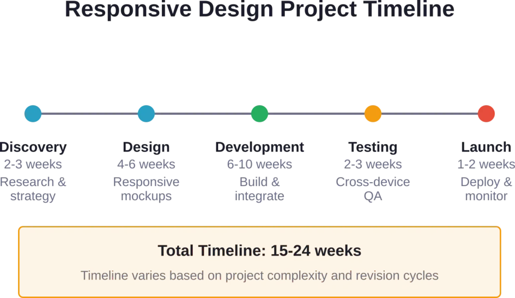
Timeline depends heavily on scope and complexity. A responsive marketing site with 10-15 pages typically requires 3-4 months from kickoff to launch, including discovery, design, development, and testing phases. More complex projects—web applications, e-commerce platforms, or sites with extensive custom functionality—can take 6-12 months. Rush timelines are possible but often compromise quality, particularly in cross-device testing.
Most agencies on this list work with remote clients regularly and have adapted processes for distributed collaboration. They use tools like Figma for design collaboration, project management platforms for coordination, and video conferencing for meetings. Some agencies prefer occasional in-person workshops for discovery or key milestones, but generally remote partnerships work smoothly with established digital agencies.
Geography matters less than it used to, though some considerations remain relevant. Time zones affect meeting schedules—teams separated by 8+ hours find real-time collaboration harder. Legal and contractual frameworks sometimes favor domestic agencies. Cultural understanding can matter for consumer-facing sites. But many successful partnerships span continents, particularly when agencies have strong remote processes. Prioritize capability fit over location.
Test their work on actual devices, not just resize desktop browsers. Look for sites that feel designed for mobile, not merely adapted. Check loading speed on throttled connections. Evaluate whether navigation works well at small sizes. See how they handle complex components like data tables or image galleries on mobile. Read case studies to understand their responsive strategy thinking. Ask for live URLs so internal teams can evaluate thoroughly.
Responsive wireframing helps agencies and clients align on content priority and structural decisions before visual design begins. Quality agencies create wireframes at multiple breakpoints—typically mobile, tablet, and desktop—showing how information architecture adapts across devices. This process surfaces questions about content hierarchy, navigation patterns, and functionality that are easier to resolve before high-fidelity design begins.
All agencies on this list handle responsive redesigns of existing sites. In fact, redesign projects are common—many organizations need to modernize sites that predate mobile-first thinking or leverage new capabilities in modern CSS and JavaScript. Redesign projects often involve content migration, SEO preservation, and careful transition planning that new builds don’t require. When evaluating agencies for redesign work, ask specifically about their experience with migrations and SEO continuity.
Conclusion: Finding Your Responsive Design Partner
The responsive web design landscape in 2026 offers sophisticated options for organizations serious about digital experiences that work everywhere.
These 15 agencies—Lengreo, Gilzor, OSKI Solutions, A-listware, Mobian Studio, Excited, Clay, Code and Theory, Instrument, Fantasy, Locomotive, Basic Agency, Ueno, Build in Amsterdam, and Area 17—represent different approaches to responsive challenges. Some emphasize conversion optimization, others creative excellence. Some focus on specific verticals like SaaS or e-commerce, others work across sectors.
But they share common traits: strategic thinking about how responsive design supports business goals, technical excellence in implementation, mature processes that include cross-device testing, and portfolios demonstrating successful responsive work.
Choosing among them—or evaluating other agencies—requires clarity about project goals, content complexity, budget constraints, and organizational priorities. The best responsive design partner isn’t the most awarded or the most expensive. It’s the agency whose strengths align with specific project needs and whose process fits how teams prefer to work.
Start by testing agencies’ existing work on multiple devices. Read detailed case studies. Talk to references about responsive execution specifically. Review proposed approaches to understand how different agencies would tackle responsive challenges.
Responsive web design is no longer a technical curiosity or a nice-to-have feature. It’s fundamental to digital success. Mobile users won’t tolerate broken layouts, slow loading, or awkward interactions. Desktop users expect sophisticated functionality and rich content.
The agencies on this list understand this reality. They’ve built practices around creating sites that work beautifully everywhere—not through compromise, but through strategic thinking about what each device context needs.
Ready to start the conversation? Reach out to agencies whose work resonates and whose specializations align with specific needs. The best partnerships begin with clear communication about goals, constraints, and expectations. Be specific about what success looks like, what devices and contexts matter most, and how the responsive site will support broader business objectives.
Great responsive web design isn’t just about flexible grids and media queries anymore. It’s about creating experiences that respect context—device capabilities, network conditions, user intent, and interaction preferences. The agencies on this list have proven they can deliver that sophistication.