
Quick Summary: The best responsive web design companies in 2026 include Lengreo, Gilzor, OSKI Solutions, A-listware, Mobian Studio, Excited Agency, Clay, Thrive Internet Marketing Agency, and Digital Silk, each specializing in creating websites that adapt seamlessly across all devices. These agencies combine technical expertise in fluid grids and media queries with strong UX research and conversion optimization. Selecting the right partner depends on your project scope, industry focus, and whether you need integrated services like branding or ongoing support.
Responsive web design isn’t optional anymore. With mobile traffic dominating the web and Google indexing sites based on their mobile versions, brands need websites that work flawlessly across every screen size.
The challenge? Not every agency understands what responsive design truly means. Some treat it as a technical checkbox. Others focus purely on aesthetics and miss the performance side entirely.
The best responsive web design companies balance three things: technical precision (fluid grids, media queries, relative units), user experience that converts, and load-speed optimization that keeps visitors engaged. Industry analyses indicate that 40% of users abandon slow-loading pages, which makes performance a non-negotiable part of responsive strategy.
This guide breaks down 15 agencies that consistently deliver on all three fronts. Each brings something different to the table—whether that’s product-first thinking, conversion optimization, or deep expertise in specific industries like SaaS or eCommerce.
Why Responsive Design Still Defines Digital Success
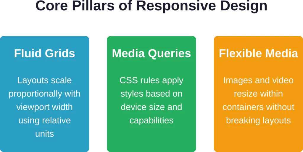
Here’s the thing though—responsive design isn’t just about making a site “look good” on a phone. It’s about preserving function, speed, and clarity no matter how someone accesses your content.
Fluid images use the max-width:100% property so they resize within their containers rather than breaking layouts. Media queries adjust typography, navigation patterns, and content hierarchy based on viewport dimensions. And relative units like percentages and ems replace fixed pixels, allowing layouts to scale proportionally.
According to research from the University of Florida’s College of Journalism and Communications, web design profoundly shapes how users perceive and engage with content and the brands behind it. Audiences form judgments within seconds, and a site that feels broken on mobile immediately undermines trust.
Real talk: small improvements in mobile flows translate into measurable differences in conversion. Optimizing load times, simplifying navigation, and making complex user journeys feel effortless can lift sign-ups and retention noticeably.
Top 15 Responsive Web Design Companies for 2026
These 15 agencies represent the strongest combination of technical skill, design thinking, and proven results in responsive web design. Each brings distinct strengths to different project types and business contexts.

1. Mobian
Mobian approaches web development as part of building high-performance digital products, with responsive design deeply integrated into scalable architecture and user experience strategy. They focus on creating clean, efficient interfaces that maintain functionality and speed across all devices.
Their responsive implementations prioritize clean architecture and intelligent adaptation, ensuring that complex features work smoothly from desktop to mobile without compromising performance or usability. Every element is designed to feel natural regardless of screen size.
Mobian works particularly well with companies in IT, Healthcare, Fintech, and Logistics that need reliable, production-ready web solutions. They excel at both full outsourcing projects and embedded team support where responsive excellence is critical.
The studio has built a reputation for delivering responsive digital products that scale effectively and perform consistently, helping clients ship faster while maintaining high quality across devices.
Contact Information:
- Website: mobian.studio
- Phone: [email protected]
- Address: Harju maakond, Tallinn, Kesklinnalinnaosa, Masina tn 22, 10113
- LinkedIn: www.linkedin.com/company/mobian-studio

2. A-listware
A-listware approaches web development through a dedicated team model, creating responsive digital solutions that emphasize quality, security, and seamless user experiences. They combine technical expertise with flexible engagement models to deliver websites and applications that adapt perfectly across devices.
Their responsive work focuses on robust architecture and thoughtful UI/UX, ensuring interfaces remain intuitive and performant on every screen size. They treat responsive design as a fundamental requirement rather than an afterthought.
A-listware is an ideal partner for enterprises, small and medium businesses, and startups that need reliable software development with strong responsive capabilities. Their solutions support complex enterprise applications, custom web platforms, and modern user interfaces.
The company delivers responsive digital solutions that empower businesses with scalable, secure, and user-friendly experiences that drive operational efficiency and growth.
Contact Information:
- Website: a-listware.com
- Phone: +1 (888) 337 93 73
- Email: [email protected]
- Address: North Bergen, NJ 07047, USA
- LinkedIn: www.linkedin.com/company/a-listware
- Facebook: www.facebook.com/alistware

3. Lengreo
Lengreo approaches web development as a core component of full-funnel marketing and business growth, creating websites that serve as powerful conversion engines rather than static brochures. They combine strategic discovery, prototyping, and implementation to build digital experiences that drive measurable results across devices.
Their responsive implementations emphasize clarity and performance, ensuring that complex user journeys remain smooth whether accessed on desktop or mobile. Every breakpoint is treated as a deliberate opportunity to optimize content hierarchy and calls-to-action for maximum conversion potential.
Lengreo works particularly well with B2B companies and service providers in tech, architecture, and event sectors that need websites to actively generate leads and support sales processes. Their designs integrate tightly with broader marketing strategies including SEO, paid ads, and lead generation.
The agency has established a strong track record of delivering responsive websites that deliver significant business impact, from dramatically increased client acquisition to substantially improved conversion rates across devices.
Contact Information:
- Website: lengreo.com
- Phone: +31 686 147 566
- Email: [email protected]
- Address: Vrijstraat 9 C/D, 5611 AT Eindhoven, Netherlands
- LinkedIn: www.linkedin.com/company/lengreo
- Instagram: www.instagram.com/lengreo.agency
- Twitter: x.com/Lengreo
4. Gilzor
Gilzor brings a product-first mindset to web development, focusing on creating custom digital solutions with strong emphasis on user-centric design and seamless cross-device experiences. They combine UI/UX expertise with full-cycle development to build websites and web applications that perform exceptionally on any screen size.
The team pays careful attention to responsive architecture from the earliest prototyping stages, ensuring that interfaces adapt intelligently while maintaining visual appeal and functionality. Their user-centric approach results in interfaces that feel native across desktop, tablet, and mobile environments.
Gilzor is an excellent partner for startups and scale-ups that need web platforms to support product validation, user acquisition, and business growth. They excel at projects where the website or web app serves as a core part of the product experience.
Their portfolio demonstrates the ability to deliver responsive digital products that not only look polished across devices but actively contribute to business metrics like user engagement and conversion success.
Contact Information:
- Website: www.gilzor.com
- Email: [email protected]
- Address: Poland, Warsaw, Office 58, street Adama Mickiewicza 37, 01-625
- LinkedIn: www.linkedin.com/company/gilzor-softwaredevelopment
5. Oski
Oski specializes in engineering robust, scalable web solutions with a strong focus on frontend excellence and responsive design. They create digital experiences that combine aesthetic sophistication with technical reliability, ensuring websites perform consistently across all devices and screen sizes.
Their responsive work integrates modern frameworks and thoughtful UI/UX principles, delivering flexible layouts that maintain visual coherence and functionality from large desktop screens down to smartphones. Performance and accessibility remain central throughout development.
Oski works particularly well with tech-forward enterprises and ambitious startups that require high-quality, future-proof web platforms. They excel at projects involving cloud solutions, complex applications, and innovative digital experiences.
The company has built a reputation for delivering responsive web solutions that support business growth through seamless user experiences and reliable cross-device performance.
Contact Information:
- Website: oski.site
- Phone: +48571282759
- Email: [email protected]
- Address: Kaupmehe tn 7, 10114 Tallinn, Estonia
- LinkedIn: www.linkedin.com/company/oski-solutions

6. Locomotive
Locomotive brings award-winning creative execution to responsive web design, with portfolios that demonstrate exceptional craft in animation, typography, and visual storytelling across devices.
The agency excels at projects where the website serves as an immersive brand experience. Their responsive implementations maintain cinematic quality and narrative flow even on smaller screens, which requires careful choreography of loading sequences, scroll-triggered animations, and adaptive layouts.
Locomotive’s technical capabilities run deep—they often develop custom frameworks and tools to achieve responsive interactions that standard solutions can’t deliver. This makes them suitable for brands willing to invest in differentiated digital experiences.
Their work frequently wins industry recognition, and their case studies provide transparent looks at process, challenges, and solutions, which can be valuable for teams evaluating technical approaches.

7. Instrument
Instrument works at the intersection of brand, product, and marketing, creating responsive digital experiences for companies ranging from startups to global enterprises.
The agency’s approach integrates brand strategy deeply into responsive design decisions. Visual systems scale coherently across devices, and interaction patterns feel distinctive while remaining intuitive.
Instrument has particular strength in product launches and go-to-market campaigns where responsive websites need to generate momentum quickly. Their designs balance immediacy and sophistication, capturing attention on mobile while rewarding deeper exploration on desktop.
The agency maintains a strong engineering practice alongside design, which means responsive implementations leverage modern frameworks and progressive enhancement techniques that improve performance and future maintainability.

8. Basic Agency (DEPT)
Basic Agency, now part of DEPT, brings a boutique agency sensibility with the resources of a larger network, offering responsive design services backed by extensive digital capabilities.
The agency’s portfolio demonstrates versatility across industries and project types, from eCommerce platforms to editorial sites to corporate presentations. This breadth means they’ve solved responsive challenges in multiple contexts and can apply proven patterns to new problems.
Basic Agency emphasizes user-centered design methodologies, conducting research and testing that reveals how responsive decisions impact real user behavior. This evidence-based approach reduces guesswork and produces designs validated by actual usage.
Their integration within DEPT provides access to specialized capabilities in areas like accessibility, localization, and platform-specific optimization, which can be valuable for complex global projects.

9. Fantasy
Fantasy creates digital products and brand experiences with an emphasis on innovation and cultural relevance, bringing fresh perspectives to responsive design challenges.
The agency works with brands and products that value differentiation and are willing to push boundaries in how they present themselves digitally. Their responsive work often introduces interaction patterns or visual treatments that feel new while remaining functional.
Fantasy’s process includes extensive prototyping and testing, which allows them to experiment with responsive behaviors before committing to final implementations. This iterative approach surfaces better solutions than linear processes.
The agency maintains a relatively selective client roster, focusing on projects where creative ambition aligns with business goals and where responsive design contributes meaningfully to brand strategy.

10. Build in Amsterdam
Build in Amsterdam combines strategic thinking, conceptual creativity, and technical execution to create responsive digital experiences that solve business problems while delighting users.
The agency’s work demonstrates strong information architecture and content strategy, which provides the foundation for responsive designs that communicate clearly regardless of device. They excel at simplifying complexity without dumbing down content.
Build in Amsterdam works across sectors but has notable experience with cultural institutions, nonprofits, and purpose-driven brands where responsive design needs to serve diverse audiences with varying technical access.
Their process emphasizes collaboration with client teams, building internal capabilities alongside delivering projects. This approach works well for organizations that want to maintain and evolve responsive sites post-launch.

11. Excited Agency
Excited Agency approaches web design through a product-first lens, focusing on clarity, structure, and conversion rather than surface-level aesthetics. The agency combines UX research, web design, branding, and motion design into websites that scale with the product and support long-term growth.
Their process emphasizes understanding user behavior and business goals before touching design tools. This means responsive implementations feel intentional at every breakpoint rather than like afterthoughts squeezed into mobile frames.
Excited Agency works particularly well with SaaS companies and digital products that need to explain complex functionality clearly across devices. Their portfolios demonstrate strong information architecture and visual systems that maintain coherence from desktop down to smartphone screens.
The agency has built a reputation for delivering designs that don’t just adapt technically but maintain persuasive power regardless of screen size. That matters for products where the buying decision might start on mobile and finish on desktop, or vice versa.

12. Clay
Clay stands out for working with high-profile brands and bringing a level of craft that elevates responsive design into brand expression. Their work spans industries but consistently demonstrates attention to detail in how layouts, typography, and interactions scale.
The agency treats responsive breakpoints as opportunities to refine the narrative rather than constraints to work around. Animations and micro-interactions remain smooth across devices, and performance stays strong even with rich visual treatments.
Clay’s approach suits brands where differentiation matters and where the website serves as a primary brand touchpoint. They work with clients who understand that investing in exceptional design and development pays dividends in brand perception and user engagement.
Their team includes strategists, designers, and engineers who collaborate throughout projects, which means responsive considerations influence decisions from wireframing through final deployment.
13. Thrive Internet Marketing Agency
Thrive Internet Marketing Agency brings a full-service digital marketing perspective to web design, which means their responsive implementations prioritize measurable business outcomes alongside technical excellence.
The agency achieved substantial growth in referral traffic from generative AI platforms using innovative AI SEO strategies—from January to October of 2025, total traffic from all AI platforms grew by +4,302%. This demonstrates their ability to adapt to emerging search and discovery patterns, which increasingly happen on mobile devices.
Thrive’s responsive designs integrate tightly with broader marketing strategies including SEO, paid media, and conversion rate optimization. This makes them particularly effective for businesses that need their website to function as a revenue engine rather than just a digital brochure.
Their process includes ongoing testing and iteration post-launch, treating responsive design as a living system that improves based on real user data. For companies that want a partner beyond the initial build, Thrive delivers sustained optimization.
14. Digital Silk
Digital Silk specializes in creating custom digital experiences for mid-market and enterprise clients, with responsive design embedded into comprehensive brand and product strategies.
The agency’s work demonstrates sophisticated use of responsive frameworks that handle complex content hierarchies, multi-step user flows, and rich media without sacrificing performance. They excel at projects where content volume and variety create real challenges for mobile presentation.
Digital Silk brings strategic consulting into the design process, which means responsive decisions align with business positioning and audience segmentation. Different user types might experience prioritized content or navigation paths optimized for their typical device usage patterns.
Their portfolio includes work for recognizable brands across sectors including healthcare, finance, and technology, where regulatory requirements and accessibility standards add layers of complexity to responsive implementation.

15. Huemor
Huemor positions itself as a growth-driven design agency, and their responsive work reflects a focus on removing friction from conversion paths across every device type.
The agency conducts extensive UX research and user testing to understand how different audiences interact with websites on different devices. This research directly shapes responsive breakpoint decisions, interaction patterns, and content prioritization.
Huemor works well with businesses undergoing rebrands or digital transformations where the website needs to signal change while maintaining continuity for existing customers. Their responsive implementations balance innovation with usability.
The agency also emphasizes transparent communication throughout projects, which helps clients understand the rationale behind responsive design decisions and participate meaningfully in the process.
How to Choose the Right Responsive Design Partner
Selecting an agency shouldn’t feel like a gamble. A structured evaluation process reveals which firms genuinely understand responsive challenges and which are just checking boxes.
Start by examining portfolios critically. Look for projects similar to yours in complexity, not just visual style. Can you see evidence of thoughtful responsive behavior? Do layouts adapt intelligently, or do they just stack elements vertically on mobile?
Ask about technical practices specifically. Good agencies should articulate their approach to fluid grids, media queries, and relative units without jargon. They should discuss how they handle images, fonts, and third-party integrations responsively.
Load-speed optimization deserves its own conversation. Responsive sites can balloon in file size if not managed carefully. Agencies should explain their strategies for performance—image optimization, lazy loading, critical CSS, JavaScript deferral.
Request case studies that include results, not just deliverables. Did the responsive redesign improve mobile conversion rates? Reduce bounce rates? Improve engagement metrics? Agencies that measure outcomes can connect design decisions to business impact.
But wait. Also evaluate cultural fit and communication style. Responsive design involves trade-offs and iteration. Working with an agency that communicates clearly and collaborates effectively makes the process smoother and the end result stronger.
Questions to Ask During Agency Evaluation
Specific questions reveal how agencies actually work versus how they present themselves in marketing materials.
Ask how they approach responsive breakpoints. Generic answers about “mobile, tablet, desktop” suggest template thinking. Thoughtful answers discuss content requirements, user research, and analytics-driven decisions about where breakpoints make sense for specific projects.
Inquire about their testing process. Do they test on real devices or just emulators? How do they handle edge cases like unusual screen sizes or accessibility tools? Comprehensive testing catches problems before launch.
Discuss post-launch support. Responsive sites need maintenance as devices evolve and content changes. Agencies that offer ongoing partnerships provide more value than those that disappear after deployment.
Ask about their experience with your platform or tech stack. Responsive implementations vary significantly between WordPress, custom applications, Shopify, and enterprise CMS platforms. Relevant experience reduces risk.
Finally, request references and follow up with them. Past clients can provide honest assessments of what working with the agency actually entails and whether results matched promises.
Responsive Design Trends Shaping 2026
The responsive design landscape continues evolving as new devices, browsers, and user behaviors emerge. Several trends are particularly relevant for projects starting in 2026.
Container queries are gaining broader browser support, allowing components to adapt based on their container size rather than viewport dimensions. This enables more modular, reusable designs that behave consistently across different page contexts.
Progressive web app (PWA) techniques are becoming standard for responsive sites, bringing app-like experiences to web browsers with offline functionality, home screen installation, and improved performance on mobile networks.
Research from the University of Florida’s College of Journalism and Communications indicates that as new tech tools become available and theories on web design change, professionals must stay current with emerging design trends. Accessibility is moving from compliance checkbox to core design principle, with responsive implementations needing to serve users with diverse abilities and assistive technologies.
Variable fonts provide new tools for responsive typography, allowing fine-grained weight and width adjustments that optimize readability across screen sizes without loading multiple font files.
And performance budgets are becoming more common, with agencies and clients agreeing on maximum load times and file sizes that responsive implementations must maintain. This discipline prevents feature creep from degrading user experience.
| Trend | Impact on Responsive Design | Implementation Consideration |
|---|---|---|
| Container Queries | Components adapt to context, not just viewport | Browser support expanding but requires fallbacks |
| PWA Techniques | App-like experiences with offline capability | Requires service worker implementation and testing |
| Accessibility Focus | Designs must serve diverse user needs and tools | Include accessibility testing throughout process |
| Variable Fonts | Responsive typography with single font files | Reduces font loading overhead significantly |
| Performance Budgets | Enforces discipline around load times and file size | Requires monitoring and optimization workflows |
The Business Case for Investing in Responsive Design Excellence
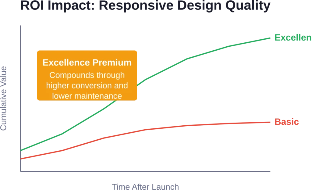
Responsive design carries real costs—more planning, more development time, more testing. So why invest in excellence rather than acceptable?
The short answer? Because acceptable doesn’t cut it anymore. Users expect seamless experiences, and competitors are investing in providing them. A merely acceptable responsive site creates friction that pushes potential customers elsewhere.
Industry analyses indicate that 40% of users abandon slow-loading pages. On mobile networks, where connection speeds vary and data costs matter, every unnecessary byte and render-blocking resource drives people away. Excellence in responsive implementation directly impacts the bottom line.
Responsive design done well also reduces long-term maintenance costs. Clean, standards-based implementations adapt more easily to new devices and browsers without requiring constant patches and workarounds.
For companies where the website drives revenue—whether through eCommerce, lead generation, or user acquisition—responsive design quality directly correlates with business outcomes. Small improvements in mobile conversion rates can generate substantial revenue increases when multiplied across traffic volume.
And there’s a competitive positioning element. A website that works beautifully across devices signals professionalism, attention to detail, and customer focus. It becomes part of the brand promise rather than just a technical requirement.
Common Responsive Design Mistakes to Avoid
Even experienced agencies sometimes fall into responsive design traps. Being aware of common mistakes helps teams avoid them.
The biggest mistake? Treating responsive design as a post-design consideration. When designers create desktop layouts without thinking about mobile constraints, developers end up forcing square pegs into round holes. Responsive thinking needs to start in wireframing.
Another common issue: testing only on the latest devices. Real users access sites on everything from new iPhones to budget Android phones to tablets to hybrid devices. Testing across a representative device range catches problems that emulator testing misses.
Performance often gets ignored until it’s too late. Adding responsive behavior on top of bloated code and unoptimized assets creates slow experiences that drive users away. Performance optimization should happen throughout development, not as a final pass.
Navigation design frequently goes wrong on mobile. Hamburger menus that hide key actions, dropdowns that don’t work well on touch interfaces, and navigation that requires too many taps all create friction. Mobile navigation deserves as much design attention as desktop.
And finally, forms often fail responsive users. Tiny input fields, inappropriate input types, validation that doesn’t account for touch keyboards—form experience can make or break mobile conversion, but it’s often an afterthought.
Integrating Responsive Design with Broader Digital Strategy
Responsive design doesn’t exist in isolation. The most effective implementations connect with SEO, content strategy, analytics, and conversion optimization.
From an SEO perspective, responsive design affects everything from mobile-first indexing to page speed scores to user engagement signals. Agencies that understand these connections create responsive sites that perform better in search.
Content strategy needs to account for how information hierarchies change across devices. What works as a long-form narrative on desktop might need to break into sections with jump links on mobile. Content and design teams should collaborate on responsive content presentation.
Analytics implementation requires careful planning for responsive sites. Event tracking, conversion funnels, and user flow analysis need to capture behavior across devices accurately. This data then informs ongoing optimization.
Conversion rate optimization becomes more complex with responsive design. Tests need to run separately by device type, and optimization priorities might differ significantly between mobile and desktop experiences.
The best responsive design projects recognize these interconnections and bring specialists together early rather than treating each discipline as a separate silo.
The Future of Responsive Design: What’s Next
Looking beyond 2026, several developments will continue reshaping responsive design practice.
Foldable and flexible screens are moving from novelty to mainstream, creating new challenges for responsive layouts that need to adapt not just to different devices but to devices that change shape during use.
Voice interfaces and conversational UI are becoming more common, requiring responsive thinking that extends beyond visual layout to include alternative interaction modes.
According to digital humanities research from NYU, static sites are increasingly recognized for their performance, security, and scalability advantages, requiring less back-end programming knowledge than dynamic sites.
Augmented reality and spatial computing introduce new contexts where traditional responsive design principles need extension or reinvention as digital content layers onto physical spaces.
And artificial intelligence is beginning to influence responsive design, with systems that can automatically adapt layouts based on user behavior patterns, device capabilities, and content characteristics.
These trends don’t make current responsive design obsolete—they build on the foundational principles of flexibility, performance, and user-centered thinking that define quality responsive work.
Frequently Asked Questions
Responsive web design is an approach that makes websites adapt automatically to different screen sizes and devices using fluid grids, flexible images, and media queries. It matters because users access websites from countless device types, and Google now indexes sites primarily on their mobile versions. A site that doesn’t work well on smartphones or tablets loses visitors, conversions, and search rankings.
Responsive web design costs vary widely based on project complexity, customization level, and agency expertise. Generally speaking, simple responsive sites might start around several thousand dollars, while complex custom implementations for established brands can reach into six figures. The investment should align with business goals and expected return through improved conversion and user engagement. Check directly with agencies for current pricing as it varies by scope.
Timeline depends on project scope and complexity. A straightforward responsive site built on an existing platform might take 6-10 weeks from kickoff to launch. Complex custom implementations with extensive UX research, custom development, and multiple rounds of testing typically require 3-6 months. Agencies should provide specific timelines during project scoping based on requirements.
One responsive site is almost always the better approach. Separate mobile and desktop sites require maintaining two codebases, create SEO complications with duplicate content, and provide inconsistent user experiences. Responsive design delivers the same content and functionality across devices with a single codebase, reducing maintenance costs and technical complexity while improving consistency.
Responsive design uses fluid grids that scale continuously as viewport size changes, providing consistent experiences across any screen dimension. Adaptive design creates fixed layouts for specific breakpoints, detecting device type and serving the appropriate version. Responsive is generally more flexible and requires less maintenance, while adaptive can sometimes offer more control over specific device experiences. Most modern projects favor responsive approaches.
Test by resizing your browser window—a responsive site should adapt smoothly as the window narrows. Also test on actual mobile devices, checking whether navigation works well, text remains readable without zooming, and interactive elements are easily tappable. Google’s Mobile-Friendly Test tool provides automated checking. If the mobile experience requires pinching, zooming, or horizontal scrolling, the site isn’t properly responsive.
This depends on the current site architecture and codebase. Sites built with modern frameworks and clean code can often be refactored to add responsive behavior without complete rebuilds. Older sites built with outdated techniques, fixed-width layouts, and table-based structures typically require ground-up rebuilds. An experienced agency can audit the existing site and recommend the most efficient path forward based on technical foundation and business goals.
Making Your Responsive Design Decision
Choosing a responsive web design agency represents a significant investment in digital infrastructure. The decision deserves thoughtful evaluation rather than rushing toward the first appealing portfolio.
Start with clear goals. What business outcomes does the responsive site need to drive? Better mobile conversion? Improved brand perception? More efficient content management? Clearer goals lead to better agency matching and more successful projects.
Evaluate agencies against both technical capabilities and cultural fit. Technical excellence matters, but so does communication style, process transparency, and collaborative approach. The best results come from partnerships, not vendor relationships.
Look for agencies that ask questions before proposing solutions. Firms that lead with assumptions about what responsive design should look like aren’t listening. Agencies that invest time understanding business context, user needs, and success metrics create better outcomes.
Consider the full project lifecycle, not just launch. Responsive sites need ongoing maintenance, optimization, and evolution. Agencies that offer post-launch support and transfer knowledge to internal teams provide more lasting value.
And remember: the cheapest option rarely delivers the best value, but the most expensive doesn’t guarantee success either. Focus on finding agencies whose approach, experience, and working style align with project requirements and business goals.
The 15 agencies highlighted in this guide represent strong options across different specializations and project types. Each brings proven expertise in creating responsive websites that work beautifully across devices while serving clear business purposes.
Responsive design excellence isn’t optional anymore—it’s foundational to digital success. Partnering with agencies that understand both the technical requirements and the business implications ensures websites that perform today and adapt to whatever devices tomorrow brings.
Ready to start your responsive design project? Begin by reviewing portfolios, reaching out to agencies whose work resonates, and having conversations about your specific needs and goals. The right partner will help transform responsive design from technical requirement into competitive advantage.